Here's our little roadside rescue end table.
It came home with us looking like this:
but it had so much potential...
I thought I would give it some color and try my hand at spray painting.
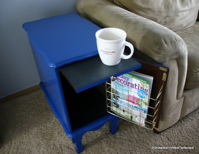
So it became this:
And we loved the rich blue. For a time.
Eventually I wanted to use it in another space and the blue just wouldn't work.
So I gave it a couple coats of white paint,
then added in some Maison Blanche in Cobblestone giving it an entirely new look...
A quick coating of wax with a bit of dark stain mixed in gave it a little bit of aged character:
It's neutral enough now to go in almost any room in my home.
This is good because if you know me you know I love to move things around...a lot. :)
For now it finishes off this space nicely.
It definitely needs some oil rubbed bronze on those little knobs for some contrast.
I'm trying to decide if I want to give it a monogram on the door front.
The white raised panel seems to be asking for something but I ran out of the Cobblestone color so I couldn't finish it with that even if I'd wanted.
What do you think? Gold on the edges of the door panel?
A Monogrammed Letter for our last name? Any other suggestions?
Thanks!
Sharing With:


It's so cute... and I agree that front door is asking for some sort of detailing! =)
ReplyDeleteHolly at Not Done Growing
I agree, the door needs something but overall it looks really great.
ReplyDeleteI am loving the makeover! I would add gold paint in the edges (front door panel) I love that you added legs to it, I would have never thought of that. I am having a linky party on sunday (starts on saturday at 6pm) please come and link this up. http://suburbsmama.blogspot.com/
ReplyDeleteWow what a transformation! Great selection of colours.
ReplyDeletegreat great great! monogramed door would be so nice!
ReplyDeleteI'm going to steal your rug, and pillows along with this beauty. Look at that mag rack inside! I love it!!!
ReplyDeleteLoving it! That color is amazing; I haven't heard of it. I say MONOGRAM! But maybe in a light neutral a few shades darker than the table but not black? Great job!
ReplyDeleteI’m visiting from Six Sisters Linky. I hope you can stop by my blog and leave a comment, too!
~ Megin of VMG206
Spring JOY Frame ~ Printable
Looks great. I also refinished the very same table a while back...stop by to see it:
ReplyDeletehttp://ppandorasbox.blogspot.com/2012/04/black-and-white-checked-end-table.html
I have never seen one just like this and I saw yours in Pinterest, so I had to stop by and check it out! I am now off to read more of your blog posts...patti@ pandora's box
i remember it blue. i like it now too. the pull out thing-y and the wire on the inside of the door are awesome features.
ReplyDeleteThe table looks fabulous-great job!
ReplyDeleteThanks so much for sharing at Project Inspired @ Setting for Four. I pinned your lovely end table makeover to our group linky party pinboard!
ReplyDeleteI hope you had a fantastic Easter and can join me tonight at 8 pm EST for Project Inspired #8!
That looks great! I love the darker color a lot!
ReplyDeleteI adore this table so much, Sherry! I shared on my facebook page last week. When my husband saw it he sent me an email telling me how much he loved it as well! Beautiful, beautiful makeover!
ReplyDeleteLove the soft neutral look! What a great find! You have made it over beautifully!
ReplyDeleteThis is such an incredible transformation and love the colors. Just wanted to let you know I'm featuring it when my link party opens up tonight. I hope you'll be a regular linker upper!
ReplyDeleteI featured you today! http://www.settingforfour.com/2013/04/5-fabulous-furniture-makeover-projects.html Pinned and shared!
ReplyDeleteI love that you keep changing up the same piece!! The blue is FABULOUS but of course it doesn't work in every area. Love your new neutral look!
ReplyDeleteThird time is a charm...I LOVE this table's latest look!
ReplyDeletebrilliant choice of color!
ReplyDeleteSherry, I really like the whole room! And I agree- I would've enjoyed the blue for awhile but the new colors are perfect for your space. I would say maybe add a bit of gold to the edges if you want. I am your newest blog follower. :)
ReplyDeleteJen
I LOVE the final makeover! It's so neat that you added "legs" to the piece! I think the monogram is a great idea or maybe even a silhouette. Great job!
ReplyDelete